
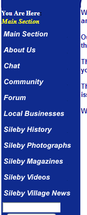
 The design of the website is very very simple and doesn't look appealing. The design of the site also looks extremely unprofessional and not very well made. Despite the unappealing design it is fairly easy to navigate the site and all of the links appear to be working and link you to the correct page. The typeface that the site uses is very easy to read and is clear but it does make the site look very boring as the design is also very plain. If I were to make an changes to the site I would change the entire design of the site as people looking at this site looking to move to the village will most likely be put off by the look and unprofessional appearance of the site. Overall I think the site has been very poorly made and needs a lot of work done to it to get it to the quality of other village websites.
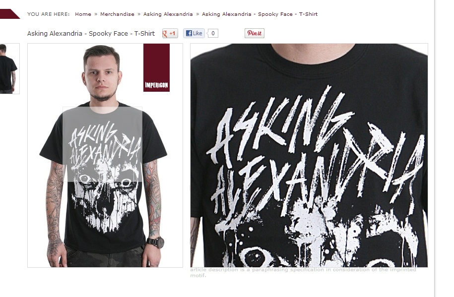 This website has a very basic design but this works very well as the site has a lot images which bring a lot of colour to the page and makes the site look very professional. The site is very easy to navigate as everything has a clear and easy to see link and all of he links work perfectly. The site also has useful features to such as a zoom option on the clothing products so you can see a clearer image of the clothing. The typography used on the site is clear, easy to read and works well on the site. I wouldn't make any changes to this site as it is as good as it can be in my opinion; it looks professional, it suits it's desired audience also the links all work well. Overall I feel that the site is very good and it looks to be made to a professional standard.
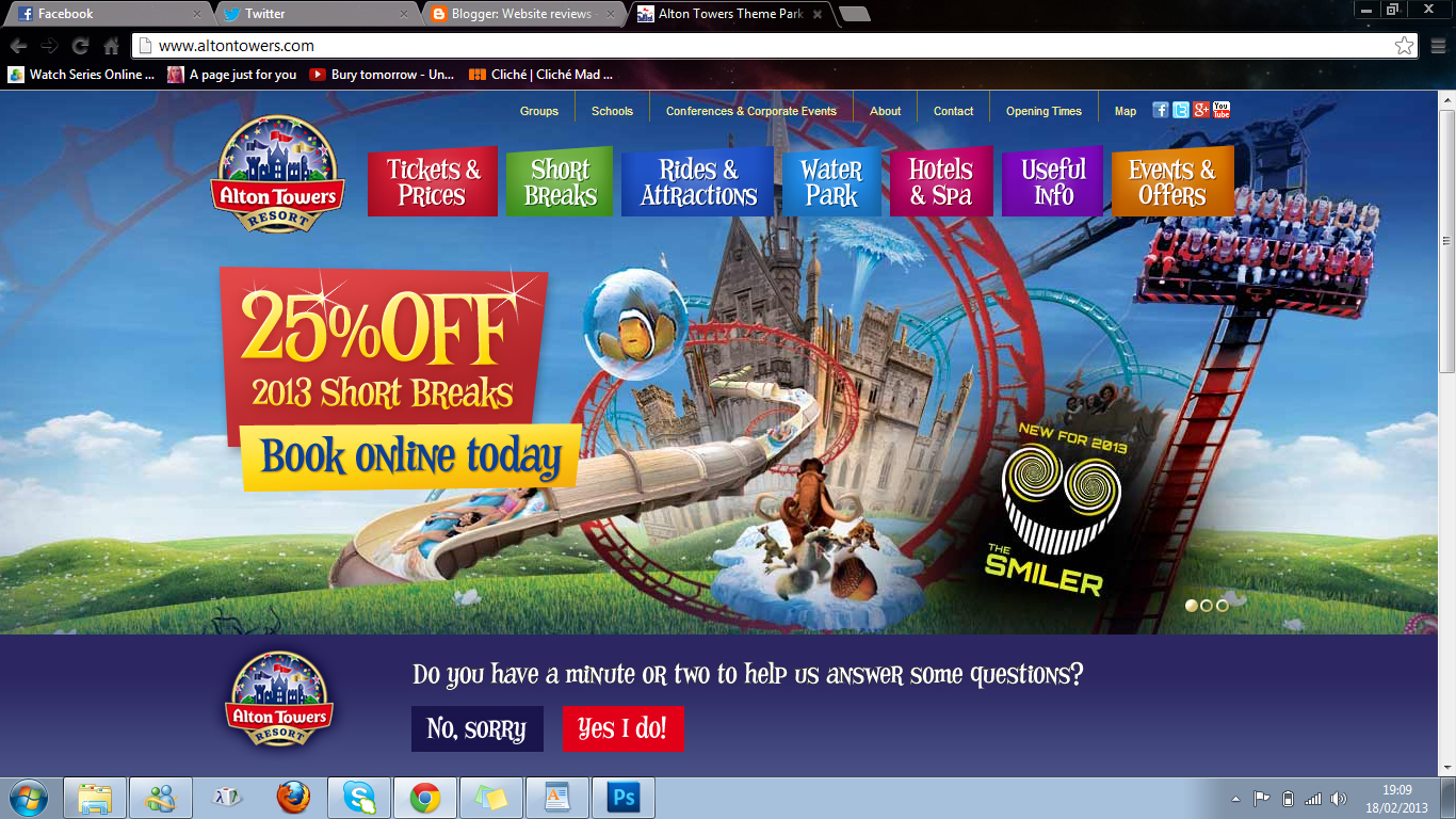
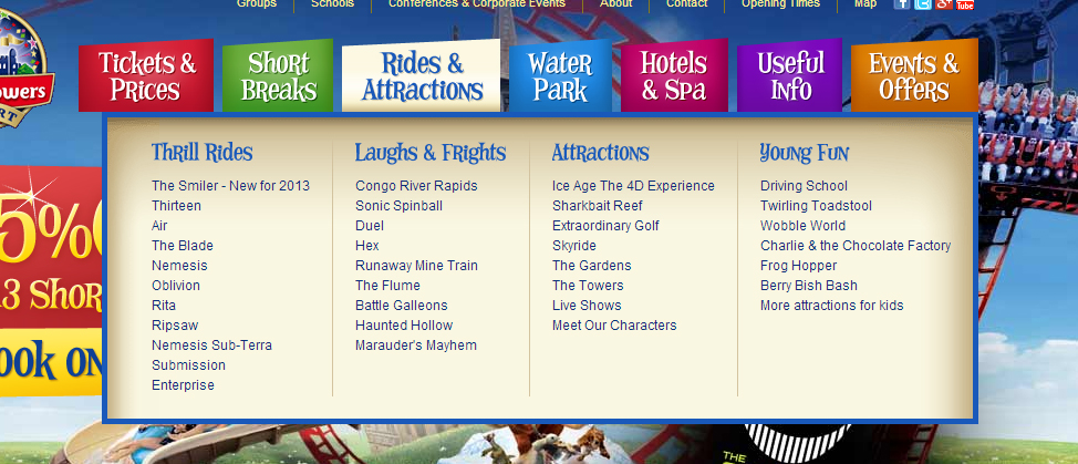 The design of the site is very good, it is very easy to read and know where everything on the site is. Another good aspect of the design is that is is suitable for all ages and advertises the resort very well. It is easy to navigate the site with the use of drop down menus and sub menus making it very easy to find the desired area of the site and go to it with minimal effort. The typography used is basic in text but the heading use the classic Alton towers typeface which is less basic and would appeal to a larger audience including children. If I was to make any improvements to the site I would have less on one pate of the site as I found it to be a little busy on the page which could make it harder for a viewer to find what they are looking for. Overall I think this is an excellent website for the resort and greatly promotes it. Also the site is made to a professional standard which helps a great deal.
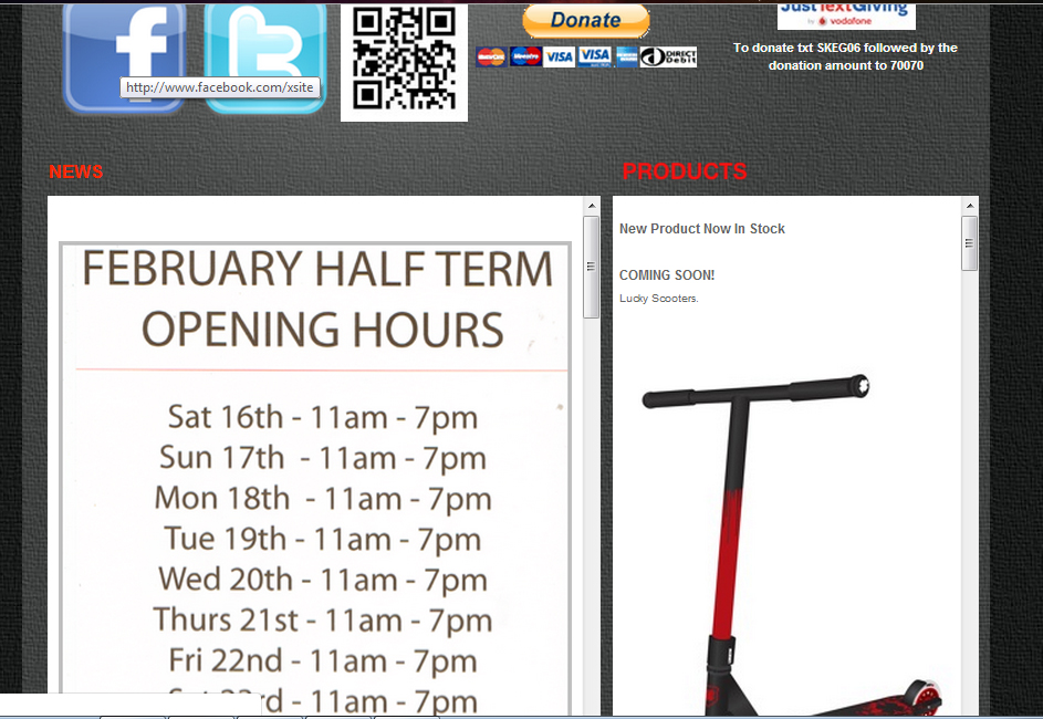 The design is basic but a colour background has been used to make the site look better and less plain. The site generally looks ok but quite unprofessional and simple, this is primarily because of the use of White text boxes with plain text in them. The site is fairly easy to navigate with sections of the site clearly at the top of the page. The type faces that have been uses are very basic but is some places the text is too big. If I was to make any adjustments to the site I would make the site more structured and try to make it more visually appealing. Overall the site that has been created could have been better and made more professionally with a more creative design to it to attract a greater number of people to the skate park.
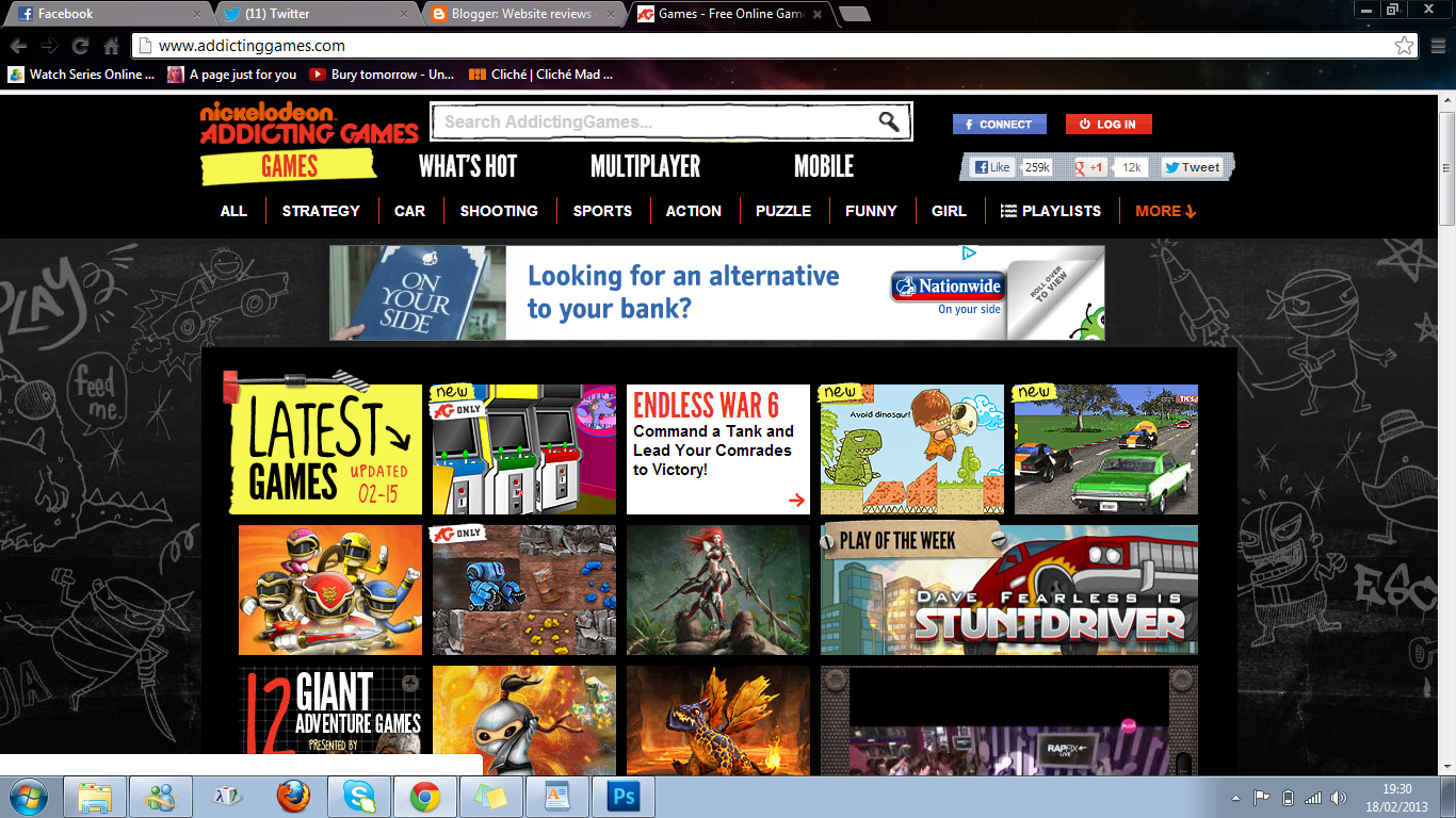
The design of the site fits the site perfectly as it is a flash games website aimed at children usually aged between 13-16 so the use of drawings around the page and the black background colour fits. Also although the site does look professional like the pizza hut website this site looks like a professional games site. It is very easy to navigate the site and find he game you are looking for and if your not looking for a particular game it is very easy to find one suited to you. This is because of the very good menu and sub menus which clearly state the types of games so if you like action games you would be able to easily find all the action games quickly. The site uses basic typefaces so that the text is clear, easy and understandable but they use White and red text in suitable places so that it appeals to the target audience. Overall I think this website doesn't need any improvements as it is very good and would appeal to the correct audience and all links work.